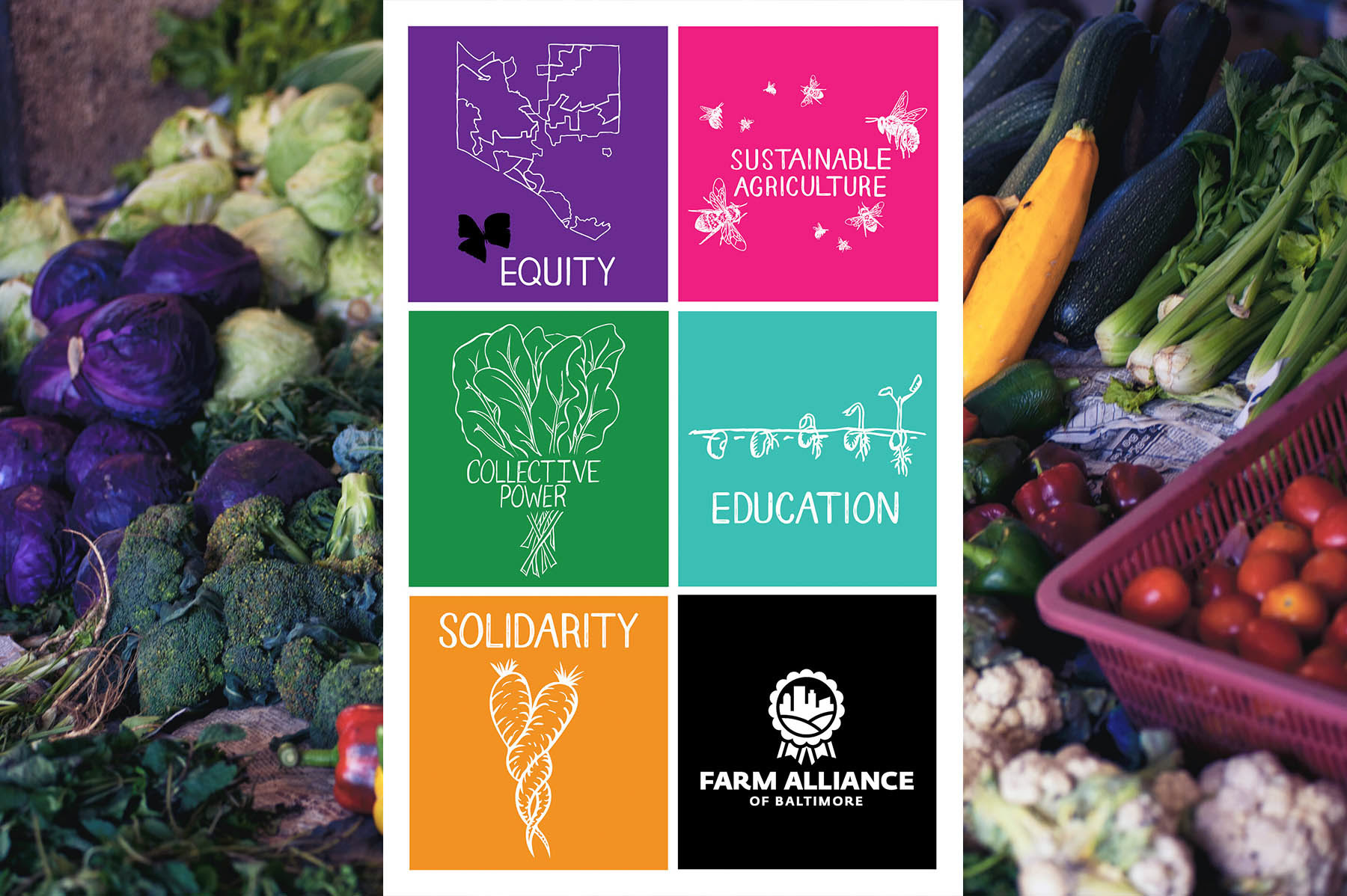
Farm Alliance of Baltimore Core Value Icons
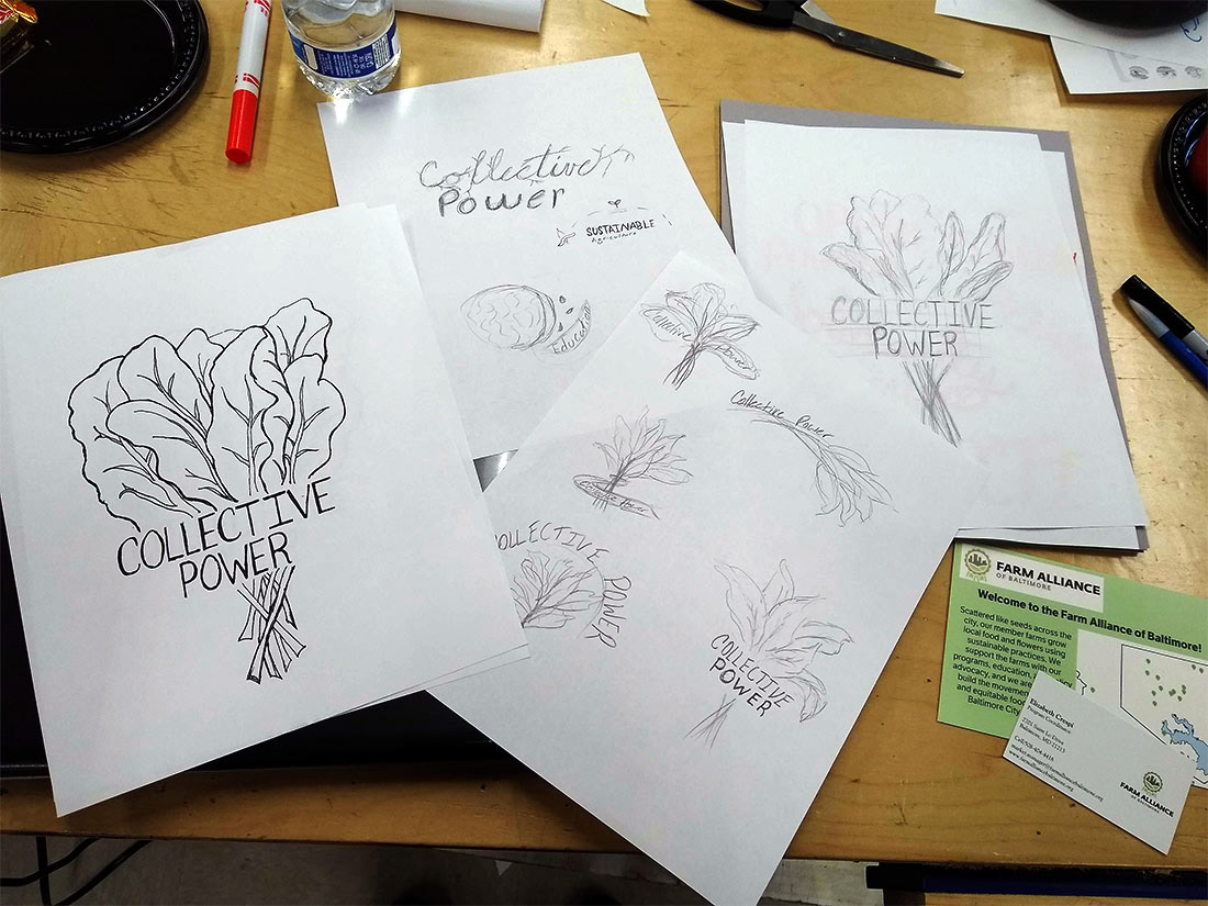
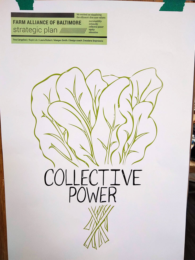
I had the opportunity to be introduced to the Farm Alliance of Baltimore and this project while volunteering at MICA’s 2019 Grassroots DesignFest. It is a one day event where nonprofits who are in need of some design help come and are partnered with a group of designers. It’s a wonderful opportunity to flex your skills for a fast paced project. Working with a random group of fellow artists was an exciting challenge to quickly collaborate rolls in designing for our nonprofit client. During my design sprint for Farm Alliance of Baltimore they needed a visual representation for their core values to aid in the education of the alliance. To quickly cover all of the core value icons our group of four decided to each take a value and illustrate it. Since a style wasn't already set by the alliance we were given the flexibility to design in our own styles. Some went very illustrative and geometric in their interpretations. Those did match their logo but I on the other hand looked at the existing content of FAB. They had just recently designed a produce van that the market manager of FAB said everyone was especially proud of. The van featured botanically illustrated vegetables. I decided to take that illustration technique and simplify it to create the core value icon. My design process and technique worked and I was the one selected to continue the work of creating the rest of the icons along with the lettering! My team of designers switched to a team of farmers who I collaborated with to create designs that fit everyone’s approval. Care had to be taken into the design of these icons to be sure they properly represented the values that FAB worked hard towards. These icons also had to be relatable and easy to read or understand by a wide variety of people. This is especially important since the icons would be seen by the whole community of Baltimore both digitally or printed and hung proudly in FAB’s farmer’s market booth.

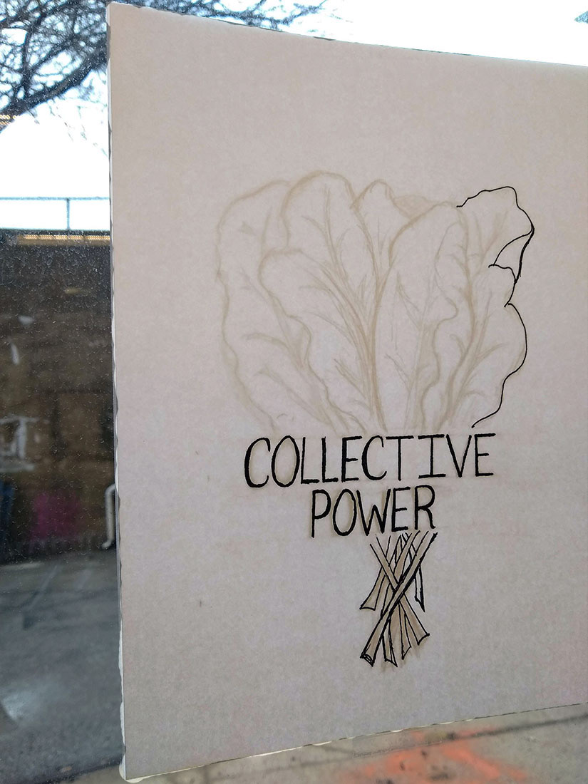
On the right is the final vector rendering for the day. On the left is my go to transfer method for when I don't have access to a light-box and need to make a tracing quickly

It might be just the back of my head but I really like this photo since it captures the moment that MICA's president Sammy Hoi stopped by my team's work. He was interested in learning more about the project we had as well as my own design process. Photo credit, Christopher Myers Photography.
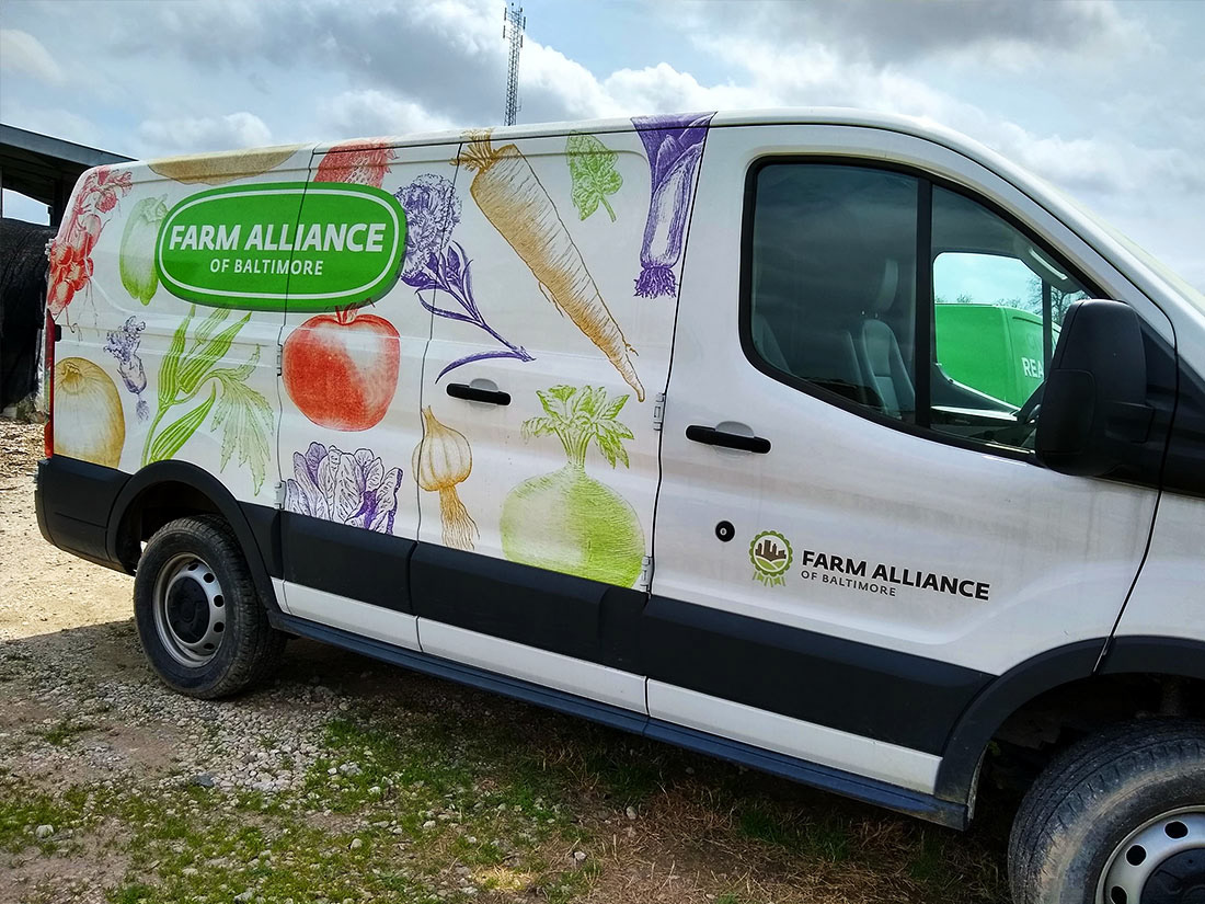
I got to see the famous truck in person! This truck not only inspired the illustrative direction which helped me be chosen for this job, but it also was what had given me inspiration the year before when I created my other project "Everyday I'm Brusselin."
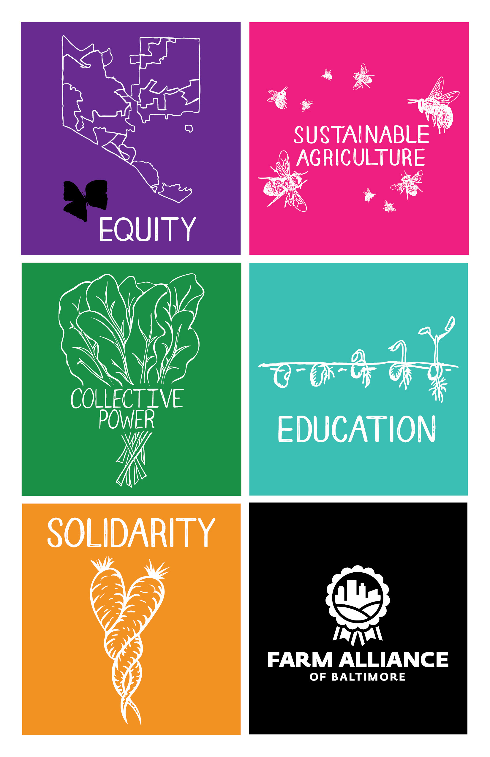
The part of this project that posed the most difficulty was creating the illustration for equity. It was a challenge to get the message of equity across without being generic. They did not want a hand as a icon. I asked the director what they focused on the most when it comes to the issue of equity and she told me the story about the black butterfly. A research study was performed to understand the racial segregation and investment patterns in Baltimore. This is an issue that has been occurring for well over a hundred years and can be visually represented in this map of segregated black communities. Its within these communities where food deserts are also the most prevalent. Food deserts are how they sound, places where access to fresh and healthy food is scarce. To combat food deserts and the black buttery the Farm Alliance of Baltimore has many farms within these areas providing fresh healthy food directly to the community. The second best way to combat the black butterfly is to raise awareness and educate people. It was that exact reason that the icon for equity was to be a map so it could raise curiosity and create the beginning of a conversation about the black butterfly.


Above are a few examples of the core values poster. Rather it be in an email or a Instagram post this poster is quite versatile digitally or printed.